

2.Data Exploration
1.What is data exploration?
- A preliminary exploration of the data to better understand its characteristics.
- Key motivations of data exploration include
- Helping to select the right tool for preprocessing or analysis
- Making use of humans’ abilities to recognize patterns
- People can recognize patterns not captured by data analysis tools
- Related to the area of Exploratory Data Analysis (EDA)
- Created by statistician John Tukey
- Seminal book is Exploratory Data Analysis by Tukey
- A nice online introduction can be found in Chapter 1 of the NIST/SEMATECH e-Handbook of Statistical Methods http://www.itl.nist.gov/div898/handbook/index.htm
- Key motivations of data exploration include
-
Techniques Used In Data Exploration
- In EDA, as originally defined by Tukey
- The focus was on visualization
- Clustering and anomaly detection were viewed as exploratory techniques
- In data mining, clustering and anomaly detection are major areas of interest, and not thought of as just exploratory
- In our discussion of data exploration, we focus on
- Summary statistics
- Visualization
- Online Analytical Processing (OLAP)
- In EDA, as originally defined by Tukey
- Iris Sample Data Set
- Many of the exploratory data techniques are illustrated with the Iris Plant data set.
- Can be obtained from the UCI Machine Learning Repository http://www.ics.uci.edu/~mlearn/MLRepository.html
- From the statistician Douglas Fisher
- Three flower types (classes):
- Setosa
- Virginica
- Versicolour
- Four (non-class) attributes
- Sepal width and length
- Petal width and length
2.Summary Statistics
-
Summary statistics are numbers that summarize properties of the data
- Summarized properties include frequency, location and spread
- Examples: location - mean spread - standard deviation
- Most summary statistics can be calculated in a single pass through the data
- Summarized properties include frequency, location and spread
- Frequency and Mode
- The frequency of an attribute value is the percentage of time the value occurs in the data set
- For example, given the attribute ‘gender’ and a representative population of people, the gender ‘female’ occurs about 50% of the time.
- The mode of an attribute is the most frequent attribute value
- The notions of frequency and mode are typically used with categorical data
- The frequency of an attribute value is the percentage of time the value occurs in the data set
- Percentiles
-
For continuous data, the notion of a percentile is more useful.
-
Given an ordinal or continuous attribute x and a number p between 0 and 100, the pth percentile is a value xp of x such that p% of the observed values of x are less than xp.
-
For instance, the 50th percentile is the value x50% such that 50% of all values of x are less than x50%.
-
-
Measures of Location: Mean and Median
- The mean is the most common measure of the location of a set of points.
- However, the mean is very sensitive to outliers.
- Thus, the median or a trimmed mean is also commonly used.
-
Measures of Spread: Range and Variance
- Range is the difference between the max and min
- The variance or standard deviation sx is the most common measure of the spread of a set of points.
- Because of outliers, other measures are often used.
3.Visualization
- 3.1 Representation
-
Visualization is the conversion of data into a visual or tabular format so that the characteristics of the data and the relationships among data items or attributes can be analyzed or reported.
-
Visualization of data is one of the most powerful and appealing techniques for data exploration.
-
Humans have a well developed ability to analyze large amounts of information that is presented visually
-
Can detect general patterns and trends
-
Can detect outliers and unusual patterns
-
-
Is the mapping of information to a visual format
-
Data objects, their attributes, and the relationships among data objects are translated into graphical elements such as points, lines, shapes, and colors.
-
Example:
- Objects are often represented as points
- Their attribute values can be represented as the position of the points or the characteristics of the points, e.g., color, size, and shape
- If position is used, then the relationships of points, i.e., whether they form groups or a point is an outlier, is easily perceived.
-
-
3.2 Arrangement
- Is the placement of visual elements within a display
- Can make a large difference in how easy it is to understand the data
Problem with large number of partitions
-
Node impurity measures tend to prefer splits that result in large number of partitions, each being small but pure
- Customer ID has highest information gain because entropy for all the children is zero
Gain Ratio: - Adjusts Information Gain by the entropy of the partitioning (). - Higher entropy partitioning (large number of small partitions) is penalized! - Used in C4.5 algorithm - Designed to overcome the disadvantage of Information Gain
-
3.3 Selection
- Is the elimination or the de-emphasis of certain objects and attributes
- Selection may involve the choosing a subset of attributes
- Dimensionality reduction is often used to reduce the number of dimensions to two or three
- Alternatively, pairs of attributes can be considered
- Selection may also involve choosing a subset of objects
- A region of the screen can only show so many points
- Can sample, but want to preserve points in sparse areas
3.3.3 Measure of Impurity: Classification Error
-
Classification error at a node 
- Maximum of when records are equally distributed among all classes, implying the least interesting situation
- Minimum of 0 when all records belong to one class, implying the most interesting situation
Misclassification Error vs Gini Index
- 3.4 Techniques
-
Histograms
- Usually shows the distribution of values of a single variable
- Divide the values into bins and show a bar plot of the number of objects in each bin.
- The height of each bar indicates the number of objects
- Shape of histogram depends on the number of bins
- Two-Dimensional Histograms
- Show the joint distribution of the values of two attributes
-
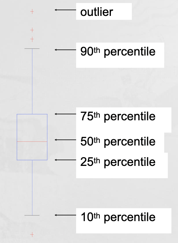
Box Plots, Scatter Plots, Contour Plots, Matrix Plots
- Box Plots
- Invented by J. Tukey
- Another way of displaying the distribution of data
- Following figure shows the basic part of a box plot
- Scatter plots
- Attributes values determine the position
- Two-dimensional scatter plots most common, but can have three-dimensional scatter plots
- Often additional attributes can be displayed by using the size, shape, and color of the markers that represent the objects
- It is useful to have arrays of scatter plots can compactly summarize the relationships of several pairs of attributes
- Contour plots
- Useful when a continuous attribute is measured on a spatial grid
- They partition the plane into regions of similar values
- The contour lines that form the boundaries of these regions connect points with equal values
- The most common example is contour maps of elevation
- Can also display temperature, rainfall, air pressure, etc.
- Matrix plots
- Can plot the data matrix
- This can be useful when objects are sorted according to class
- Typically, the attributes are normalized to prevent one attribute from dominating the plot
- Plots of similarity or distance matrices can also be useful for visualizing the relationships between objects
- Box Plots
-
Parallel Coordinates
- Parallel Coordinates
- Used to plot the attribute values of high-dimensional data
- Instead of using perpendicular axes, use a set of parallel axes
- The attribute values of each object are plotted as a point on each corresponding coordinate axis and the points are connected by a line
- Thus, each object is represented as a line
- Often, the lines representing a distinct class of objects group together, at least for some attributes
- Ordering of attributes is important in seeing such groupings
- Star Plots
- Similar approach to parallel coordinates, but axes radiate from a central point
- The line connecting the values of an object is a polygon
- Chernoff Faces
- Approach created by Herman Chernoff
- This approach associates each attribute with a characteristic of a face
- The values of each attribute determine the appearance of the corresponding facial characteristic
- Each object becomes a separate face
- Relies on human’s ability to distinguish faces
- Parallel Coordinates
-
Star Plots, Chernoff faces
- On-Line Analytical Processing (OLAP) was proposed by E. F. Codd, the father of the relational database.
- Relational databases put data into tables, while OLAP uses a multidimensional array representation.
- Such representations of data previously existed in statistics and other fields
- There are a number of data analysis and data exploration operations that are easier with such a data representation.
-


Leave a comment